Page 1 of 3

Crobat - APPROVED!

PostPosted: 30 Mar 2013 19:19
by zero_breaker
EDIT: It's approved! thanks to everyone's feedbacks!

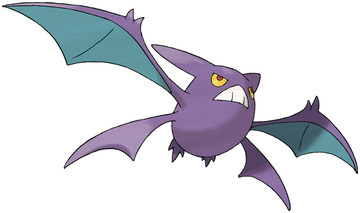
Here's Crobat, as promised.
Spoiler:
ImageImage

Re: Crobat - WIP

PostPosted: 30 Mar 2013 19:51
by Vikerus
thank you.

Re: Crobat - WIP

PostPosted: 30 Mar 2013 20:09
by Yaseen
Looking great so far

Re: Crobat - WIP

PostPosted: 30 Mar 2013 22:29
by Jack_Attack12
Looking great !!!!! Good job. Not one flaw

Re: Crobat - WIP

PostPosted: 30 Mar 2013 23:01
by ilovepokemon
looks great so far, cant wait to see the finishing results :D

Re: Crobat - WIP

PostPosted: 31 Mar 2013 20:58
by zero_breaker
Spoiler:
Image

I'm improving the texture.

EDIT: Oh well, it's done!
Spoiler:
Image

Re: Crobat

PostPosted: 31 Mar 2013 21:30
by LightAdept
Oh wow, thank you. This was an evolution i was waiting for a long time. And i got some pretty cool ideas on how to animate those wings, but if you want anything specific, just mention it and i'll try my best (though keep in mind i'm not the BEST animatior (Also, if anyone reads this post and is interesting in becoming an animator, i Get in contact with me or Mr.M and we'll talk)). Looking forward to its approval!

Re: Crobat

PostPosted: 31 Mar 2013 21:33
by Xwaffle
Looks good!

Re: Crobat

PostPosted: 31 Mar 2013 21:43
by karrybird
i think this is really good, but the eyes look too small relative to it's body size, as is the mouth as well. the eyes also should be flatter on the tops of them, they look a little too rounded here.
the colors could also be a little lighter as well.

the position of the of the upper wings also look a bit high. they should be a bit closer to the bottom ones, it shouldn't be too hard to fix. and maybe you should stretch the blue on the upper wings a bit to reach the shoulder like it shows in this image.
Image

and lastly, you should definitely add some shadows and highlights, the colors on him are way too flat...as are most of your models actually. but trust me, it would look so much better then!

Re: Crobat

PostPosted: 31 Mar 2013 21:53
by zero_breaker
karrybird wrote:i think this is really good, but the eyes look too small relative to it's body size, as is the mouth as well. the eyes also should be flatter on the tops of them, they look a little too rounded here.
the colors could also be a little lighter as well.

the position of the of the upper wings also look a bit high. they should be a bit closer to the bottom ones, it shouldn't be too hard to fix. and maybe you should stretch the blue on the upper wings a bit to reach the shoulder like it shows in this image.
Image

and lastly, you should definitely add some shadows and highlights, the colors on him are way too flat...as are most of your models actually. but trust me, it would look so much better then!

The eyes are being fixed, I usually add shades after fixing the problems so that's not a big problem, and the blue part... I think it's the arms that's too long. like this: Image

EDIT: Aaand fixed
Spoiler:
Image

Someone help me slow down, I'm already starting Scizor...

EDIT 2: Further lowered the upper wings:
Spoiler:
Image