By karrybird
#121789 The reason the parts under the chin and feet look completely black in the preview is because the normals are messed up i believe. In game it looks really weird, i'm sure you've seen crobat or blissey?
I'm not exactly sure how they can be fixed since i've never really done it myself, but i'm sure there are some helpful tutorials out there. :)
nice model by the way, i'd say it's just about done. :D

User avatar
By Ziebster
#121793
karrybird wrote:The reason the parts under the chin and feet look completely black in the preview is because the normals are messed up i believe. In game it looks really weird, i'm sure you've seen crobat or blissey?
I'm not exactly sure how they can be fixed since i've never really done it myself, but i'm sure there are some helpful tutorials out there. :)
nice model by the way, i'd say it's just about done. :D

The normals shouldn't be messed up, but I will check. It is a relatively easy fix that shouldn't take any effort to fix. I think it is just because the lighting sources I set up to work in just generally suck in blender in my opinion.

EDIT:

Looks like it just did end up being a lighting problem. After a lot of tests, and about 4 lights were added, I seem to have fixed the problem! Enjoy the (pretty much) finished model of Mawile! :D
User avatar
By Arsonist
#121838 Image
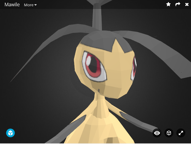
Got a bit of a grinch mouth goin on here.

Something i'd suggest, before uploading fixes to Sketchfab, is exporting the model as an obj, then putting the .obj, the texture file, and the .mtl you should get from the export into a .zip folder, then uploading the .zip file with the .obj in it rather than the file format you're using. When people are inspecting your model, stationary lighting gets in the way of us seeing your textures and model.
It's a bit irritating, but it's a benefit to those who view and critique your models.

Now let's get to what's bugging me about the model itself.
| Show
Image
Image

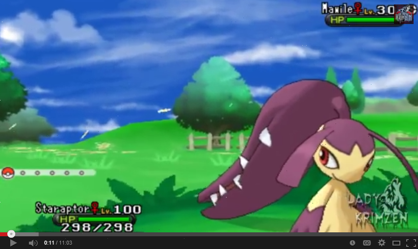
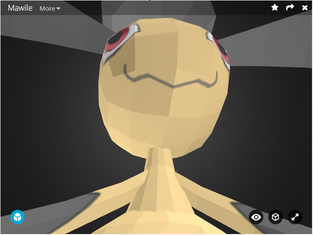
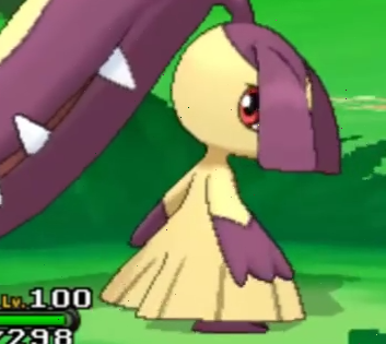
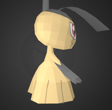
So above is the model from pokemon x and y and on the bottom is a screencap of your model.
There are some differences in both the texture and the model that are keeping me from liking your model.

First is the shape of the head. While your model has an elongated sort of egg-on-it's-side shape to it, Mawile's head in x and y is more rounded, and plump, with the mouth being extruded a bit.

The hair...ribbon...things on the x and y model are more down and forward on the head, while the same geometry on your model is closer to the base of the appendage thing with the teeth, and are oriented in a different way.

Now for the eyes. I don't dislike the eyes much at all, and when/if you fix the shape of the head it's eyes should fix themselves a bit too. The other issue i have with the eyes is the location of it's irises. As it is, each eye is basically looking 45* in their respective directions. I'm not entirely sure how it's going to be oriented in-game, but it's going to either be looking forward, or backward. Likely forward for regular movement and backward for battle at some point in the future. For now i'd just move the irises toward the front of the eyes to make it look more like it's looking forward.

Now the arms. The arms, to me, are the biggest issue with the model. In x and y the arms on Mawile are much wider, but with the same thickness as yours, while yours maintain a much more uniform width.

Now the legs. Not a huge issue, i just don't like it's butt. It's far too pronounced. Also the leggings are more sloped in the x and y model.
| Show
Image
Image


And that, ladies and gentlemen, is about as much as i've ever posted in a post.
As with all of my critiques, ever, they're suggestions, not mandatory. You don't need to listen to me, but i wouldn't post all of this if i didn't think it's exactly what the model needs.
User avatar
By DarkMoon
#121842 The neck is to long I also suggest bringing down the size.
User avatar
By Arsonist
#121845
DarkMoon wrote:The neck is to long I also suggest bringing down the size.

The issue is the shoulders, not the neck. The shoulders on the Mawile model for x and y are more pronounced, instead of arms that slope from the neck
User avatar
By Ziebster
#121894
Arsonist wrote:First is the shape of the head. While your model has an elongated sort of egg-on-it's-side shape to it, Mawile's head in x and y is more rounded, and plump, with the mouth being extruded a bit.

The hair...ribbon...things on the x and y model are more down and forward on the head, while the same geometry on your model is closer to the base of the appendage thing with the teeth, and are oriented in a different way.

Now for the eyes. I don't dislike the eyes much at all, and when/if you fix the shape of the head it's eyes should fix themselves a bit too. The other issue i have with the eyes is the location of it's irises. As it is, each eye is basically looking 45* in their respective directions. I'm not entirely sure how it's going to be oriented in-game, but it's going to either be looking forward, or backward. Likely forward for regular movement and backward for battle at some point in the future. For now i'd just move the irises toward the front of the eyes to make it look more like it's looking forward.

Now the arms. The arms, to me, are the biggest issue with the model. In x and y the arms on Mawile are much wider, but with the same thickness as yours, while yours maintain a much more uniform width.

Now the legs. Not a huge issue, i just don't like it's butt. It's far too pronounced. Also the leggings are more sloped in the x and y model.

As with all of my critiques, ever, they're suggestions, not mandatory. You don't need to listen to me, but i wouldn't post all of this if i didn't think it's exactly what the model needs.


Wow... :D I have been longing for one of these comments ever since I started! This told me everything!

To start:
1) Head, ears, hands, body, and feet 100% redone.
2) Head no longer egg-shaped, instead it is a sphere with a bit added to the front for the mouth area.
3) Ribbon pieces repositioned and put lower on the skull.
4) Eyes positioned to look straight ahead on the model
5) Added more details to the arms when I redid them 1. For ease in modeling the fingers and 2. it makes them look nicer :3
6) Butt removed and legs slanted more in the back!
7) In the old model the chest area and the legs were seperate which caused funny polygon overlap which I was never happy with, so I just connected the body and legs together this time.

And finally I would like to thank you, Arsonist, this comment practically brought me to tears when I read it the first time it was so beautiful. I hope you enjoy the new model!

User avatar
By Arsonist
#121909 Looks much better! Now i think the arms might be just a touch too long, then i think it's ready for approval :)
User avatar
By Ziebster
#121915
Arsonist wrote:Looks much better! Now i think the arms might be just a touch too long, then i think it's ready for approval :)


Fixed in the above model!
User avatar
By Arsonist
#121940 Looks much better :D
JOIN THE TEAM